During 2008-10, AM+A worked with Activant, Livermore, California, a primary provider of inventory and point-of-sale software for retail stores such as hardware and automotive parts. These stores must typically track thousands of items in order to ensure that back-end inventory is managed efficiently and effectively. AM+A evaluated both cashiers and technical administrators in several hardware stores then designed more effective user-interface paradigms for key order processing functions, such as purchasing and receiving.
Activant: Inventory Management Software UI Evaluation and Design
Adobe Systems: Circulate™

AM+A designed and wrote the UI specifications of a desktop application for text and image document scanning, “OCR’ing,” and storing.
Designed to accompany digital copiers/scanners in networked environments, Adobe Circulate brings state-of-the-art scanning, Optical Character Recognition (OCR) conversion, and document management functions to its users. Adobe came to AM+A with the Circulate technology in place, and a general idea of what the mental model of the user-interface should be. Established competitors had been winning awards for their usability of their products, so Adobe needed Circulate’s UI to be, as Adobe says, “state-of-the-art.” AM+A designed and wrote the complete UI design specification, including icons, detailed file display and manipulation behaviors, keyboard navigation, menus, and commands. AM+A also created the product’s distinctive desktop icon.
Adobe Systems: Press Ready™

AM+A designed and user-tested a high-end color Print dialogue box.
AM+A: Customized Currency

Aaron Marcus has proposed a “modest plan to save the US economy.” His redesign of US currency involves the US Treasury Department allowing anyone’s face to appear on the front of US currency and any corporate logo on the back, provided each sponsor pays $100 million to the US Treasury. If 7,000 wealthy people and corporations sign up worldwide, that would raise $700 billion for the US Government, about half the 2010 fiscal deficit or about the amount that the government paid for the recent economic bailout. This design project provides an incentive to wealthy individuals and companies to give part of their wealth to the US Government. Grandparents might want to see their grandchildren featured. Entertainment stars and political leaders could see their faces everywhere. This idea recognizes that one of the US’ greatest exports is its US currency. Read more
AM+A: Green Machine

Finding a sustainable way of life is a 21st-century global challenge. The “green” movement helped to increase people’s awareness of sustainability issues and propelled development of products to help decrease our ecological footprint. Smart grid applications enabling users to monitor their energy consumption are some of these innovative products. However, most are targeted to the PC and don’t focus on innovative data visualization. Communicating critical data helps build awareness, but does not result automatically in effecting behavioral changes. The question then shifts to how exactly to motivate, persuade, educate, and lead people to reduce their energy consumption.
For the Green Machine project, 2009-10, AM+A researched, analyzed, designed, and evaluated powerful ways to improve sustainability-oriented behavior by persuading and motivating people, especially home consumers to reduce energy consumption and increase increase efficiency and recycling by means of a well-designed mobile phone application concept prototype: the “Green Machine.” AM+A designed and tested a prototype Green Machine application oriented to making energy conservation behavior changes and redesigned and improved the user interface based on interview-participant feedback. The Green Machine uses principles of combining information design/visualization and persuasion design.
AM+A’s presentation and white paper explain the development of the Green Machine’s user interface, information design, information visualization, and persuasion design. The project has been published in case studies and articles in the USA, Europe, South Africa, and South Korea. Aaron Marcus has lectured about the project in Canada, France, Germany, Switzerland, and the USA, among other countries. Aaron Marcus’ Green Machine lecture is on YouTube:
AM+A: Health Machine

Finding a life-enhancing and life-preserving way of life is a 21st-century global challenge. Obesity and type 2 diabetes are increasing in many countries. Health/nutrition information, products, and services available to increase people’s awareness of health issues and propel changes by monitoring food are targeted to the PC/Web, do not focus on innovative data visualization, and lack persuasive effectiveness. Communicating critical data helps build awareness, but does not result automatically in effecting behavioral changes. The question then becomes: How can we motivate, persuade, educate, and lead people to reduce their food consumption and exercise more?
For its Health Machine concept design of 2010, AM+A researched, analyzed, designed, and evaluated powerful ways to improve healthful behavior by persuading and motivating people, especially those 50+ from lower economic and educational levels, to reduce food consumption and increase exercise by means of a well-designed mobile-phone application concept-prototype: the “Health Machine.” The author’s firm designed and tested a prototype Green Machine application oriented to making energy conservation behavior changes in 2009. The Health Machine uses similar principles of combining information design/visualization and persuasion design. AM+A reviewed the presentation with a certified dietician and redesigned screens based on her recommendations. AM+A’s presentation and white paper explain the development of the Health Machine’s user interface, information design, information visualization, and persuasion design. AM+A is publishing a case study about the project and lectures about the project worldwide.
Anonymous Clients: Cross-Cultural Analysis
For two different clients, as yet not disclosable, AM+A provided cross-cultural analysis services.
In one project, AM+A conducted a culture audit of a software product that the client was localizing for a very different language, writing system, and culture. AM+A analyzed the graphics, icons, terminology, and concepts of the original product, using the assistance of third-party language-subject-matter experts. AM+A idenetified problemmatic issues and provided specific recommendations for improvements. The client considered AM+A’s report very valuable for the localization process. Without this kind of analysis, one might make excellent translations of content that should never have been included in the first place.
In a second project, AM+A conducted an analysis of the country and corporate cultures of a major corporation with offices in many countries. AM+A identified potential issues that might affect the ability of multi-disciplinary, multi-cultural, multi-country teams to cooperate, collaborate, and communicate. Examples of differences included culture-influenced teams in which This information enabled the client to develop better solutions for its development teams.
Arab Nations Website: Arabia Online
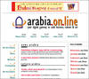
AM+A designed the homepage of an informational Arab nations Website.
Arbor Software, Inc.: Essbase Applications Manager
AM+A designed the mental model and navigation for an application that builds and manages business operations financial information.
Essbase Applications Manager, the central product in the suite of Essbase tools, builds/configures Essbase Multi-Dimensional OLAP Databases. Arbor was upgrading their client/server product to make it more powerful and easier for financial managers to build custom financial reports and models about their company. In designing the user-interface of this centralized “hub” product, AM+A’s key challenge was to build in flexibility. Our design had to stand up to: 1) anticipated increases of complexity in future enterprise-wide networks, 2) the need to seamlessly link to various other component products, and 3) the need for our design to be easily extended to a suite of accompanying products. First, we built an overall mental model and navigational structure that gave users a complete, clear overview of their data environment and controls. Then we converted the current dialogue-driven UI (one that relies heavily on memory and abstract concepts) into a direct manipulation environment – one that gives the user continuous feedback as they build data structures and manage data objects.
Aspect Telocommunications: Starbuck™, Tesla™, and Lynx™
Aspect Telocommunications: Starbuck™, Tesla™, and Lynx™
AT&T Advanced Telephony Applications
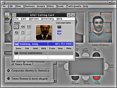
AM+A designed and produced the UI / branding for a research prototype of advanced telephony applications.
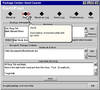
Autodesk: AutoCad™
![]()
AM+A designed and tested the UI for a CAD database search tool for a leading CAD application.
Babyface Design for Mobile Devices and the Web
Small displays on mobile devices and information appliances, e.g., cellular phones and personal digital assistants, provide special challenges to effective user-interface (UI) design, especially for Web-based services. This extreme form of UI design can be called babyface design. Challenges include limited spatial and color resolution, limited font choice, limited space, and information visualization in the form of miniature charts, maps, and diagrams, particularly table/list navigation. Current products will improve as designers gain more experience.
The complete article can be viewed in the file below.
BMW: Future Vehicle UI

AM+A advised BMW on driver-centered design and how it affects next-generation vehicle user interfaces.
Services
UI Strategy, Human Factors Research
Project Duration
Oct 01 – Jan 02
Media
Study about in-vehicle UI design
Project Description
AM+A advised BMW on driver-centered design and how it affects next-generation vehicle user interfaces.
Vehicle UI design occurs in a rapid, demanding, competitive context worldwide. In order to plan the successor to the pioneering but controversial 7-Series i-Drive, BMW asked AM+A to develop a comprehensive study of vehicle user-interface principles and tradeoffs, including human-factors data and automotive safety guidelines. This study provided compelling driver-centered design perspectives for BMW’s marketing, strategy, engineering, and design groups.
Today’s car manufacturers, including BMW, are quickly introducing computerized options that can radically alter the vehicle experience for riders as well as drivers. These options include navigation, communication, advanced comfort, and driving assistance features. These options initially appear attractive, but they can place new demands on drivers’ attention and ability to respond, potentially compromising safety and marketability.
AM+A’s challenge was to discover and define how new options can best enhance the driving experience while remaining safe and enjoyable to use.
BMW needed answers to such challenges as:
- How to provide advanced features without compromising safety?
- How to create innovative designs that are easy to learn and use?
- How to prioritize or enable/disable options in order to support safe driving?
- When to use visual, auditory, and tactile sense channels, and how to coordinate multi-modal information?
- How to determine which functions are appropriate for a graphical user-interface and Which are best supported by physical controls?
- How to determine the number of options to present to a driver on a single screen?
AM+A’s report to BMW emphasized the importance of designing from a driver-centered perspective in order to create a truly successful vehicle experience.
California Virtual University: California.edu

AM+A designed and produced a distance learning Website with a catalog of all distance courses at California’s colleges and universities.
The California Virtual University, a non-profit organization, was founded based on a grant from Gov. Wilson in 1997 to build an on-line catalog and resource center for distance learning opportunities offered by all California colleges and universities. The delivery mechanism was to be a Website titled “California.edu.”
CVU turned to AM+A to design and produce the site. We first partnered with a Web technology firm, GonzoMedia, for their expertise in database-driven Website development. Together we developed a convenient, searchable, database-driven catalog of over 1,500 courses (offered by over 300 institutions).
Key challenges were: 1 – Foster an online community, accessible both technically and emotionally to all demographic groups. 2 – Make the site’s identity appear “official” yet friendly. 3 – Convey that CVU is just a catalog and does not grant degrees. 4 – Avoid any institution or system bias in the users’ search process.
Call Center Information Tracking
AM+A designed prototype appearance systems for a hybrid client/server and Web-based sales information application.
Camstar: Insite™
AM+A designed the mental model, navigation, and icons for a Manufacturing Execution System (MES) for integrating and managing information from the factory floor.
Certified E-mail Delivery Service
AM+A reviewed the UI of a product that provided guaranteed, “certified” e-mail delivery service.
Charles Schwab: Internal Design Guidelines
AM+A designed UI guidelines for several brokerage internal operations applications.
Cogito Learning Media: Electronic Companion™ Series
AM+A designed and produced a college-level CD-ROM series of comprehensive study guides with interactive educational content, quizzing, and scoring.
The Electronic Companion Series is a series of educational multimedia titles (currently 14 titles and growing), targeted at college freshman-level students in Life Sciences, Mathematics, and Economics majors. These products assist students in preparing for their exams by supplementing textbooks and lectures with review and self-testing modules that use animation, video, and interactive exploration – all the strengths of multimedia – to bring the content to life. Developing a successful UI design, with a strong product identity and with navigation/interaction paradigms that are easy to learn and use (so as to maintain the user’s focus on the content), was only the beginning of AM+A’s involvement. Beyond that, over the course of our four-year relationship with Cogito, we have provided Series concept development, art direction, content specifications, and production guidelines for authors and editors to increase the efficiency of subsequent series product development. Finally, we have managed the implementation of the entire series using Macromedia Authorware™, in strict accordance with aggressive, timed releases based on school-year cycles (semesters, etc.).
Cogito Learning Media: Knowledge Now™ Series
AM+A designed and produced educational science reference CD-ROM series with video-driven procedural and technical information.
Cogito: Eye to Mind

AM+A Designed and produced a series of CD-ROMs containing educational multimedia science content.
Services
User Interface Design, Project Management, Programming, CD-ROM Mastering
Project Duration
June 98-Oct 98
Media
Macromedia Director on CD-ROM
Project description
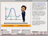
Cogito Learning Media, Inc., a publisher of educational multimedia products, asked AM+A to design the user-interface for its Eye-to-Mind series of CD-ROMs for high school and undergraduate science students. Eye-to-Mind is an audio/visual aid to be referenced by professors during lectures, and to be used as a study aid. Cogito’s challenge was to create a high-quality product with a narrow focus that could sell at a very low price point.
AM+A de-emphasized navigational controls in order to focus attention on the content. This simple, neutral, quiet interface encourages exploration, and allows for easy re-use of the shell for other titles. Animations such as the Aids virus invading a cell, voice-overs, diagrams, and images convey high-level, difficult-to-understand concepts in an engaging narrative format. Audio voice-over helps retention by allowing students to hear as they see, as well as to help them learn correct pronunciation of scientific terms.

Quiet Interface
Cogito wanted a “neutral stage” to present a variety of modular content consistently. The content is simply organized and is not extensive in scope, allowing minimal titling. Eye-to-Mind is meant to be browsed and experienced over and over by students to solidify their understanding of the content.
Subtle Lighting Effects
Live items on the screen “backlight” on rollover to signal their status.
Favoring quality versus quantity, Eye-to-Mind fully leverages the combination of motion, sound, color, layout, and narrative to efficiently convey information in a form that is clear and memorable.
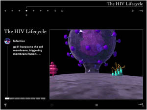
Harpooning a Cell
AM+A worked with top scientific illustrator/animators to convey content authored by the leading authors in the field. We were a key link in the team’s effort to convert “book information” into interactive content.
Careful storyboarding and an iterative review process with the authors ensured accuracy and quality control.
In this view, the illustrator visualizes the Aids virus “harpooning” and penetrating a living cell membrane. Assigning shapes, colors, positions, and movements to such abstract concepts as cells, viruses, and proteins drastically improves students’ memory retention.
Audio voice-over
Eye-to-Mind delivers narrative content to students via voice-overs instead of using long, scrolling text passages. Transcripts, however, are easily accessible via pop-up windows.
The voice-overs allow students to focus on the animations and thus benefit from the increased retention resulting from seeing and hearing coordinated content. Voice-overs also help students to correctly pronounce complex scientific words, which is an important part of impressing any science professor!
CompuServe: Digital Message-Management
AM+A designed a prototype for a universal digital message-management system.
Consensys
AM+A consulted on the UI design of a manufacturing process management system.
Corporate Banking Services for Bank of America

AM+A designed a prototype for a Web-based corporate banking application.
Project Description
To help Bank of America (BofA) expand its offering of extranet tools and services, AM+A designed and built a prototype of a Web-based banking application for corporate customers. BofA needed to learn what its corporate customers would want from a Web-based account service. AM+A proposed using Macromedia Director™ to build a detailed, yet simple and easily navigatable prototype that could be quickly learned and presented by a focus group moderator to groups of BofA customers. The prototype modeled functions necessary for the completion of typical user tasks (e.g., funds transfers, balance reporting, etc.), and was careful to provide convincing data and to match BofA’s corporate branding guidelines. In addition, AM+A provided the script used by the marketing research moderator to describe the product to the focus group participants.
Done.com

AM+A designed the appearance and assisted in the overall UI development for a Web-based task management and project collaboration application.
Done.com needed AM+A to design the appearance and detailed interaction for its Web-based task management and project collaboration application. Working from an existing prototype, AM+A quickly re-organized commands and displays, and upgraded the appearance design to prepare for a round of user assessment sessions and investor presentations.
Intended as a light project management tool for individuals and groups, Done.com provides a means to record, classify, sort, assign, and track tasks related to projects that may involve large, geographically dispersed teams. It also provides e-mail and scheduling tools to further facilitate tele-collaboration. A major challenge for the UI design effort was to provide a way to display and sort tasks by a variety of attributes, such as due date, urgency, assignor, status, and others.
To allow precise organization of the anticipated high accumulation of user tasks, AM+A recommended implementing Done.com’s task display filtering system by using picklists. This allows users to categorize tasks by several variables, and then control how and when they appear in the “To Do” List. AM+A also differentiated major screens from minor ones by combining a tab-like high level navigation with small child windows.
Elixir Technologies: Opus Designer™
AM+A designed the UI for an application used to create templates for database-driven, dynamically composed printed documents, including bank statements, employee benefit books, etc.
Enterprise Engines
AM+A designed icons and screens for a visual programming environment.
Executive Search Product

AM+A designed and produced a CD-ROM publishing format for customized multimedia executive recruiting interviews.
Federal Reserve Bank: FedLine™
AM+A designed the UI for the Windows NT™ and Web versions of the world’s highest-volume electronic funds transfer application.
Federal Reserve Bank: Intranet/Extranet UI
AM+A designed a prototype UI for an intranet/extranet application for Federal Reserve account reporting for banks.
Fujitsu FOSSI: Teamware™
AM+A consulted on the prototype UI design of a Web-based groupware application.
Fujitsu: Teamware™
AM+A consulted on the “Americanization” of a leading European groupware product.
HP: Three Decades of Projects
Beginning in 1984 and continuing across three decades, AM+A worked with several R+D, human factors, marketing, and product development teams.
AM+A digitized the HP logo for the first time in HP’s history for HP’s desktop publishing corporate clients in 1984 and developed a clip-art library as an HP Vectra product.
In 1992, AM+A designed HP’s corporate standards and templates for slides created in three desktop slide-making applications.
During 2003-2005, AM+A worked closely with the Director of HP’s Mobile Media and Systems Lab to write and design executive marketing presentations of next-generation products. HP’s CEO complimented AM+A’s presentation, and the presentation helped land a partnership with Starbucks.
In 2005, after helping to design the key control screens for HP’s first commercial version of its Halo telepresence system, AM+A worked with HPs product development group to conduct usabiity tests for its second-generation Halo system.
IITRI: Golden Gate
AM+A designed the UI and tutorial for a database search tool for Pentagon Generals.
Intel Corporation
Founded in 1968 and headquartered in Santa Clara, California, Intel is the world’s largest semiconductor chip maker, developing integrated circuits and other advanced integrated digital technology products to computing, communications, and other industries. Intel’s products line include chips, boards and other semiconductor products that serve as the building blocks integral to computers, servers, consumer electronics, handheld devices, and other networking and communications products. Component-level products include microprocessors, chipsets and flash memory.
In 2008, Intel engaged AM+A to facilitate the development and testing of the user interface for its product designed to assist C++ developers in improving program performance by providing targeted code analysis, advice and instruction for implementing parallelism within a serialized program. Target users of Threading Advisor are developers and architects experienced in writing serialized code, yet unaccustomed to coding to support parallelism, and possibly even unfamiliar with core threading concepts. AM+A conducted these tasks.
Needs Analysis: Provided thorough examination of the existing prototype and supporting documentation, in addition to critical insights into the reasons for existing usability issues and an array of possible solutions and improvements.
Conceptual Design: In Round 1, provided new conceptual models incorporating an improved user interface and new features, such as streamlined navigation, task list integration and management, expandable and collapsible instructions, and other modular elements.
Usability Testing: Conducted two-day testing session and wrote detailed report of test findings and recommendations.
Conceptual Design: In Round 2, added updates to the first conceptual design document, included minor revisions and changes identified in AM+A’s usability testing report.
Visual Design: Included full-color screens and a full product icon set.
Intel’s project manager was very satisfied with AM+A’s work and provided a letter of recommendation.
IQ Financial: Risk IQ™
AM+A designed the UI for a client/server application for investment bankers to use in assessing, assigning, and managing investment risk.
IQ Financial, Inc., a software development company owned by Banker’s Trust, markets software that allows key decision-makers in large financial institutions to assess, assign, and manage investment risk. Risk IQ stores and tracks diverse investment data, and makes it understandable to users by calculating risk levels and comparing them to pre-established limits. Risk IQ was powerful as a product, but its user-interface had grown overly complex over time due to layers upon layers of added functionality. AM+A was asked to simplify the Risk IQ user-interface and to design the integration of new features as part of a complete functional and visual redesign. To cut through the massive tables of financial data, we suggested using convenient summary “headlines” of key trend and status information. These headlines engage executive-level users by making the news easy to find. Most risk management products ignore the needs of the executive by not separating the important information from the routine data.
Justsystem: Japanese word-processing application
AM+A designed screen appearance systems for the leading Japanese word-processing application.
Kaiser Permanente: Online Library
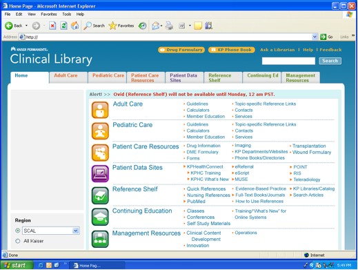
AM+A designed/tested improved navigation and screen design for Kaiser’s
online library viewable by all doctors and nurses in the US’s largest healthcare provider.
Project Description
Overview
In June of 2006, Kaiser Permanente (KP) engaged AM+A to analyze and test the usability of the Clinical Library (CL), a Web-based internal information resource. The Clinical Library makes a wide variety of clinical information available to physicians, clinicians, and nurses, both during actual patient care and at times when they are engaged in research or study. Through the Clinical Library, KP clinicians and nurses can find internally produced guidelines for medical conditions and procedures, find and print out patient handouts, reach other Kaiser Websites, access external resources such as journals and medical texts, and reach a wide variety of other resources of a operational or managerial nature.
Working with a team from CMI, AM+A drew up an interview script and interviewed sixteen clinicians and nurses in their offices in four KP regions: Colorado, Northern California, Northwest, and Southern California. Subjects were given a series of mostly medical questions, and asked to find answers using Clinical Library.
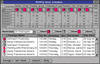
• The Usability Analysis report resulting from this study detailed both the powerful potential of the CL to serve its target audiences and numerous severe usability issues currently limiting its effectiveness, particularly during time-critical periods of actual patient care.
• The report detailed 31 major “observations” concerning usability issues, grouped in four general categories such as “Search Issues” and “Navigation Issues.” A fifth category detailed observations of the effectiveness of “Clinical Tools,” a partial restructuring of the CL UI that had been implemented in the Colorado region. A table of priorities was prepared based on comments by the interview subjects. AM+A made preliminary recommendations for how each issue could best be resolved.
In the fall of 2007, Kaiser asked AM+A to propose a usability analysis and design project to address some of the issues discovered in the 2006 report. The proposal divided work into two Phases:
• Phase 1 was a rapid, two-month project focused on a “proof of concept” redesign of the most time-critical parts of Clinical Library, with four rapid tasks including a paper user test conducted by phone.
• Phase 2 was a six-month complete redesign, including the development of an interactive prototype and three user tests in the field.
Redesign Phase 1
The rapid, preliminary Phase 1 consisted of four tasks:
• Consult with Kaiser Experts
AM+A prepared a questionnaire designed to solicit input from Regional Physician Leads, CL Content Managers, and other key stakeholders, asking their opinions about high-level usability issues and the importance of particular CL features. AM+A summarized their observations in a report, which was used as guidance in later tasks.
• Develop Conceptual Design
Based on the 2006 research and the prior consultation with stakeholders, AM+A prepared a series of annotated wireframe screens focused on the most important parts of the CL for users engaged in patient care.
• Develop Visual Design
After revisions based on consultations with the client, visual design details applied to the conceptual design wireframes, including the design of a set of icons. AM+A prepared a sequence of screens for use in testing.
• Conduct User Test
Phase 1 concluded with a test of a series of screenshots, conducted by phone with 27 doctors, nurses, physician’s assistants and clinical pharmacists from six Kaiser regions. The test included a comparative exercise, in which subjects were asked to state their preference among three different approaches to a central portion of the library. One approach was the Clinical Tools, developed internally by the client. The other two were variations of a “faceted navigation” technique proposed by AM+A.
The reaction of those users tested was highly encouraging, suggesting that the general design direction was well chosen. As always, user response was also very informative concerning which aspects of the design were successful and which required more work.
Redesign Phase 2
The full redesign phase began in June 2008 and concluded in December 2008. The general design approach for the core Clinical Library, chosen during Phase 1, was progressively refined, tested, and refined again. The redesign was expanded to cover the complete Clinical Library, including sections that had not been addressed during Phase 1. There were 11 Tasks in all, summarized as follows:
• Develop and Refine Taxonomy and Faceted Navigation
Working with a leading Kaiser physician and other client personnel, AM+A assisted in the refinement of a “taxonomy” logically organizing the different types of content in the CL. AM+A prepared a terminology questionnaire designed to elicit expert opinions from senior stakeholders concerning which of a set of alternative terms should be used as labels for key structural elements in the CL. The faceted navigation structure originated during Phase 1 was refined based on the results of the Phase 1 User Test and developments in the Taxonomy.
• Develop Conceptual Design in Three Stages
At three points during the six-month process, AM+A prepared a series of rough mock-up screens, with annotations noting changes that had been made since the previous version. Changes were occasioned by the results of user tests and ongoing discussions between AM+A and key representatives of KP, and regular large meetings including Physician Leads from each KP region and others representing interested KP departments.
• Develop Visual Design in Three Stages
After information architecture issues had been resolved during each Conceptual Design task, an AM+A Visual Designer prepared final versions of key screens, including the creation of icons and the final placement of key controls.
• Conduct First User Test
The evolving design was tested three times, with different groups of approximately 12 Clinicians and nurses for each test, who were visited in their offices in four Kaiser regions. In the first test, users were shown a series of screenshots and asked a series of questions to answer using the redesigned screens. AM+A prepared a report after each test, with annotated screenshots detailing the results and suggesting options for improvement.
• Second and Third User Tests
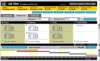
In the second and third user tests, users were asked to find answers to typical questions using a web-based interactive prototype of the redesigned system. These tests, which were recorded using the usability testing software Morae, had three parts. The first part focused on introducing the redesign, and testing specific points that had proved problematic in earlier tests to see if a solution had been found. In the second, users were asked to find answers to the same question twice: once using the prototype redesign, and once using the current system. Finally, users were given a short survey asking their overall impressions of the new system. The reports for these tests included graphs comparing how long users took to complete their tasks using the two systems, and graphs showing the results of the survey. AM+A also prepared a compilation of video excerpts from each User Test, showing the screens of users engaged in using the two systems (current and revised) while also displaying their faces and voices in a PIP (picture-in-picture) format.
• Write Requirements Document
Using a template provided by the Kaiser Information Technology (IT) Department, AM+A prepared a highly detailed list of requirements for implementation. These requirements included Business Objectives for the redesign project, User Requirements, Functional Requirements, Integration Points with other systems, and Non-Functional Requirements. After review by Kaiser IT, AM+A revised this document twice.
• Write Business-Case Document
Working in collaboration with Kaiser personnel, and using another client template, AM+A assisted in the writing of a Business Case based on the work completed in the several phases of the project and plans for implementation. The presentation included the charts created during one of the User Tests, and an assessment of the return-on-investment (ROI) of implementing the project in production.
Results
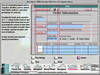
With each successive test, Kaiser clinicians and nurses became increasingly strong in their decisive preference for the redesigned system. As shown in the chart below, “Results of User Test 3 Comparative Exercise,” users took much less time finding answers using the redesigned system, despite relative unfamiliarity with it (most users had been using the Clinical Library for years). This positive result was confirmed in one of the survey questions, the results of which are displayed below in the chart “User Survey Result.” Asked to choose on a scale of 1 to 10 how strongly they agreed with the proposition “If the CL were redesigned along the lines of this prototype, I would probably be able to find the information I need more easily,” user responses all fell in the 7-10 range.
Home Page: Current

Home Page: Redesigned
Faceted Navigation Filters and Two-Column Link-Display

Results of User Tests 3: Comparative Exercise

User Survey Result

Kaiser Permanente: UI for Medical Information System
AM+A designed a prototype UI for a hospital medical information system.
For Kaiser Permanente, AM+A designed graphical user interface prototypes and guidelines for existing, command-line based, clinical information software used by doctors, nurses, and hospital administrators. Designed to allow access to patient medical records and physician schedules.
Kaiser: Online Library Evaluation and Design
Kaiser Permanente (KP) is an integrated managed care organization, based in Oakland, California. Operating in nine states and Washington, D.C., Kaiser Permanente is the largest managed care organization in the United States. Kaiser Permanente has 8.7 million health plan members, 156,000 employees, 13,729 physicians, 37 medical centers, 400 medical offices, and $34.4 billion in annual (2008) operating revenues and $1.3 billion in net income.
In June of 2006, Kaiser engaged AM+A to analyze and test the usability of the Clinical Library (CL), a Web-based internal information resource. The Clinical Library makes a wide variety of clinical information available to physicians, clinicians, and nurses, both during actual patient care and at times when they are engaged in research or study. Through the Clinical Library, KP clinicians and nurses can find internally produced guidelines for medical conditions and procedures, find and print out patient handouts, reach other Kaiser Websites, access external resources such as journals and medical texts, and reach a wide variety of other resources of a operational or managerial nature.
Working with a team from CMI, AM+A drew up an interview script and interviewed sixteen clinicians and nurses in their offices in four KP regions: Colorado, Northern California, Northwest, and Southern California. Subjects were given a series of mostly medical questions, and asked to find answers using Clinical Library.
The Usability Analysis report resulting from this study detailed both the powerful potential of the CL to serve its target audiences and numerous severe usability issues currently limiting its effectiveness, particularly during time-critical periods of actual patient care. The report detailed 31 major “observations” concerning usability issues, grouped in four general categories such as “Search Issues” and “Navigation Issues.” A fifth category detailed observations of the effectiveness of “Clinical Tools,” a partial restructuring of the CL UI that had been implemented in the Colorado region. A table of priorities was prepared based on comments by the interview subjects. AM+A made preliminary recommendations for how each issue could best be resolved.
In the fall of 2007, Kaiser asked AM+A to propose a usability analysis and design project to address some of the issues discovered in the 2006 report. The proposal divided work into two Phases: Phase 1 was a rapid, two-month project focused on a “proof of concept” redesign of the most time-critical parts of Clinical Library, with four rapid tasks including a paper user test conducted by phone. Phase 2 was a six-month complete redesign, including the development of an interactive prototype and three user tests in the field.
AM+A completed its final work on the project at the close of 2008. Final user tests showed significant improvements in speed of navigation and user satisfaction. Based on the success of the project, Kaiser provided a letter of recommendation.
MindAlliance: Corporate Brand Identity
AM+A designed and developed the corporate brand identity and user interface for a site that matches buyers and sellers of Web development services.
MindAlliance asked AM+A to create a working prototype to that would demonstrate an internet business concept that allows buyers of Web development services to find the talent most suited to their needs, allows Web developers a way to present their capabilities online, and provides a database matching engine to bring them together and help them collaborate.
AM+A partnered with Vertigo Software, Inc. to develop a complete solution, including the logo and identity, messaging, service offerings, site design, database structure, and implementation. The identity and site design needed to convey a very high-quality image, as well as encourage users to explore the site without having their initial experience front-loaded with cumbersome registration tasks. On a functional level, the site needed to be powerful and simple, and would rely upon having members enter in as much information about their project or service as possible in order to allow richer matching.
The matching engine acts upon service type, geographical location, timeframe availability, and rates and budget values in order to provide search results that are specifically tailored to the needs of the user. Before users enter crucial identification and contact information results and register and post a project or service profile, the “Quickmatch” feature allows new users to experience the site by allowing them access to cursory information. Developers’ profiles contain enough relevant information for buyers to make their decisions, including sample Web pages and links.
Motorola, Nokia, and Samsung: Advanced Mobile UI Design
Since 1989 for Motorola, 1996 for Nokia, and 1997 for Samsung, AM+A has worked with advanced R+D groups in research, design, and evaluation of next-generation mobile products.
In 2006, AM+A developed use scenarios and designs for video-related applications involving social networking, then carried out user evaluations to obtain user-feedback about the designs.
In 2005, AM+A developed personas and use scenarios to help Nokia envisage next generation smart phones. This work was carried out for Nokia’s UK-based design center.
In 2000, AM+A researched, then designed more than 100 smart phone concepts for Samsung mobile devices targeted for North America. AM+A published a case study about its work in Interactions Magazine.
Motorola: Advance Navigator™
AM+A designed UI prototypes of a complete in-car vehicle navigation system.
N2K: Music Boulevard™
AM+A conducted usability and UI design evaluations of a leading music e-commerce Website.
News Datacom
AM+A consulted on UI design of prototypes for a Web-based video storage and retrieval system.
Nokia: Communicator 9000™
AM+A consulted on the UI design of a hand-held communication device.
Noverus
AM+A designed a prototype Website that provided lifetime investment planning for individuals.
Omnibox: Omnibox System™
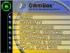
AM+A designed the UI for an interactive television broadcasting service.
Oracle Corporation: Developer 2000™ Series
AM+A wrote, designed, and produced a CD-ROM used for software developer training in user-interface design.
Oracle Corporation: Education Standards
AM+A designed prototype educational UI guidelines for Web-based training.
Oracle Corporation: Forms and Reports™ Tutorials
AM+A designed and produced a CD-ROM series used to train software developers how to use Oracle’s Forms and Reports™ database software.
AM+A designed and produced a series of CD-ROM Multimedia Training tools used to train software developers on the use of Oracle’s Forms and Reports™ database software products. These instructional products convey terminology and higher level functions, and detail procedural demonstrations of critical functions. Oracle took full advantage of our Computer Based Training (CBT) expertise. We defined the instructional approach, created content (animations, illustrations and procedural demonstrations), designed the user-interface, and produced and mastered the final product. Our design was used as the basis for future products in the series.
Pacific Bell: At Hand™
AM+A conducted formal usability tests and consulted on the design of a Web-based business directory comparable to the Yellow Pages.
Pinpoint Solutions: CaPSURE.net research Website
AM+A designed and developed the corporate brand identity and user interface for a site that matches buyers and sellers of Web development services.
CaPSURE™ (Cancer of the Prostate Strategic Urologic Research Endeavor) is a longitudinal observational study of prostate cancer patients nationwide. Working with Pinpoint Solutions, a database consulting firm, AM+A designed and developed the user interface for Capsure’s secure database of patient information shared by hundreds of clinics in the United States.
The site needed an appearance design that reflected the organizational identity established with the CaPSURE™ logotype. It also needed an effective way for users to navigate among patient and clinic charts.
AM+A designed a system of scrollable and zoomable time-based charts that make the information accessible and easy to compare across patients and clinics.
Pivotal Software, Inc.: Pivotal eRelationship: Partner Hub™ and Customer Hub™
AM+A designed navigation and appearance systems for a database-driven, Web-based marketing information application.
Pivotal Software, Inc. markets integrated application software products for corporate Customer Relationship Management (CRM). Their product allows distributed sales forces to build databases and share information about their clients and prospects. In 1998-99, AM+A assisted Pivotal in making the jump to the World Wide Web by designing the user-interface for a new application suite entitled Pivotal eRelationship. This new product enables Pivotal Customers and their staff to access/update critical database information remotely via Internet Relationship Hub servers. Pivotal had an extremely short development cycle. Our main challenge was to convert Pivotal’s Client/server product into a Web product. This involved a number of changes to the detailed interaction, navigation, and appearance characteristics of the UI. One particular issue was designing a distinct, branded appearance to the product that would not overwhelm the product’s customized customer branding. Finally, the design needed to be flexible in order to dynamically display changing sets of controls and information, while remaining clear and consistent in its global navigation and command controls.
Random House: New Media
AM+A designed a CD-ROM catalog of CD ROM titles.
SABRE Group: Business Travel Solutions
AM+A designed the appearance system for a suite of corporate travel booking tools used by corporate travel offices.
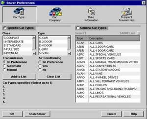
SABRE Group: Car and Hotel

AM+A designed the UI for a rental car and hotel reservation extranet application for travel agents.
Project Description
The SABRE Group: Planet SABRE™: Car and Hotel
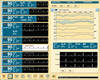
AM+A designed the UI for a rental car and hotel reservation extranet application for travel agents as part of its six-year relationship with SABRE.
The SABRE Group maintains one of the world’s top travel reservation computer systems used by over 30% of the world’s travel agents. Well aware of the increasing productivity pressures being encountered by travel agents, from fee caps imposed by airlines to competition from the Internet, SABRE saw the need to radically upgrade their product’s aging command-line user interface to a more user-friendly and powerful graphical version. Based upon AM+A’s design of SABRE’s flagship Air booking product, AM+A completely redesigned the Car and Hotel booking applications within the Planet SABRE suite of applications. Consistency in the user-interface was critical for good usability performance, and AM+A’s key challenge was to maintain standards of mental model, navigation, and workflow across applications, while still addressing the unique qualities and constraints of each booking market. Each user-centered design effort heavily involved travel agents throughout for their design ideas and reviews.
SABRE Group: Graphical Air

Putting the controls into the hands of the travel agents with custom, fully-interactive tools in SABRE’s Graphical Air.
Services
User Interface Design, Specification writing
Project Duration
Jan 95 – June 99
Media
Director Prototypes, Java Implementation, Dialup Network
Project Description
The SABRE Group maintains one of the world’s top travel reservation computer systems, which is used by over 30% of the world’s travel agents. Well aware of the increasing productivity pressures being encountered by travel agents, from fee caps imposed by airlines to competition from the Internet, SABRE saw the need to radically upgrade its product’s aging command-line user interface to a more user-friendly and powerful graphical version.
From 1994 through 2000, AM+A completely redesigned SABRE’s flagship Air Booking application, a part of the suite of products called Planet SABRE. AM+A also designed the accompanying Seat Map program, which features animated passengers. AM+A’s interactive design specifications helped guide the 30+ member programmer team. In all, AM+A worked with SABRE for six years with future lines of business: PlanetSabre, Travelocity, and Sabre Business Solutions corporate reservations.
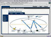
Design of Graphical Air
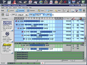
Gantt bars depict flight durations, stopovers, aircraft size, and meals.
Because travel agents get paid for each reservation and survive by repeat business, they need to work quickly and accurately. Therefore, one of AM+A’s main design objectives was to allow as much interaction as possible to occur conveniently on the main screen.
The integrated Route Field allows fluid, on-the-fly city and date entry and then draws a “map” of the trip. Chart-like bars depict flight duration, stopovers, meals, and aircraft size. Context-sensitive hotel, car, and other “Coupons” can be used or saved for other trips. The “Bin” at the bottom collects alternative Itineraries for easy comparison. The detail matrix to the right of the fares shows details and fare rules for the flights.
Controls and data are arranged according to users’ workflow, moving from the upper left to the bottom of the screen.
Animated Passengers
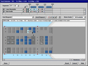
The Seatmap Utility
Graphical Air’s Seatmap Utility allows travel agents to select the best seat for their customers. Clear mapping allows easy decisions for Aisle, Window, and bulkhead seat assignments, as well as for avoiding the dreaded seats near lavatories and the mysterious “undesirable” seats, marked ” : ( “.
Before/After Specification View
Current seatmap data is in the form of a matrix of letterforms that map out the aircraft cabin. AM+A designed a mapping system that can take seatmap data from any airline and dynamically draw graphical maps that are visually and sematically consistent from plane-to-plane. The travel agents’ customers are placed in seats automatically according to predefined preferences, but can be reassigned by the travel agent to alternative seats if necessary. Reassignments send the passenger icons running to their new seats.
At the top, a matrix provides a cell for each passenger and each leg of the trip being booked. This acts as a visual aid to track progress in assigning seats for all passengers on all flights.
Interactive Specifications
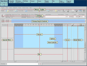
To communicate AM+A’s designs to SABRE’s Product Managers and Usability engineers, AM+A developed prototypes in Macromedia Director based on typical use scenarios. To communicate AM+A’s entire set of detailed design specifications to SABRE’s team of over thirty software engineers in multiple locations, AM+A developed an interactive specifications format using Macromedia Director.
Specifications in context
Point-and-click navigation allowed SABRE engineers to easily find the often-updated design specs that combined artwork, text, and animations describing and naming the many custom widgets, behaviors, and navigation. AM+A built the specifications’ navigation system based on typical screen views of Air Booking’s Main screen and other working screens. Showing animated sequences allowed AM+A to convey the complex inter-relatedness of the objects and commands.
Engineers need Specs that are complete, accessible, convenient, unambiguous, and detailed in order to accurately build products as designed. AM+A’s Interactive Specs accomplished all of these for Graphical Air.
Download Demo
SABRE Graphical Air Demo Compressed (1.3MB)
SABRE Graphical Air Demo Uncompressed (4.9MB)
This is a Macromedia Projector file that demonstrates the appearance and high-level functionality of this project.
Technical information: Monitor support for the Demo is 800×600 running at 8bit (256) color. Windows 95/NT/98/XP/Vista compatible.
How use the Demo: Use the Left and Right arrow keys on an extended keyboard.
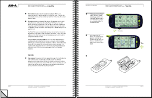
Samsung: Mobile Information Device

AM+A helped Samsung innovate wireless devices of the future, using a unique process of research and contextual observation.
Services
Market Research, Contextual Observation, Focus Group, Concept Ideation, UI Prototyping
Project Duration
Aug 00 – Dec 00
Media
Macromedia Flash
Project Description
AM+A helped Samsung innovate wireless devices of the future, using a unique process of research and contextual observation.
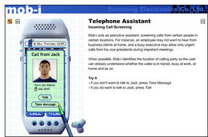
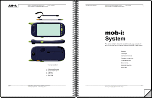
Samsung asked AM+A to study the future of mobile phones and PDAs, and design a next-generation “smart phone.” The challenge was to come up with a design that would both respond to and enable new behaviors, while avoiding the easy answers of “technology in search of a problem”. The result was the user-interface for a mobile information device that we named “Mob-i.”

Innovation comes from understanding unmet human needs. AM+A began with multi-pronged research, studying cultural and market trends, particularly in Europe, Asia and the US. AM+A contrasted the inherent strengths of desktops, laptops, and hand-helds. From our findings, AM+A created a framework that placed usage in five categories: relationships, self-enhancement, information resources, entertainment, and mobile commerce.
Contextual Observation
Given the hurdles of a “baby-face” display and tedious text entry, AM+A knew it would be a challenge making the device useful as well as usable. The best market intelligence often comes from simply spending time with your users. Smart phones will have social as well as business uses, so we spent days shadowing people in their normal daily routines. AM+A watched first-hand how they use not only cell phones and Palm Pilots, but also scratch paper and sticky notes. AM+A analysts took photos and logged the behavior of users as diverse as an entrepreneur, a teenager, and a minister, in order to inform the design.
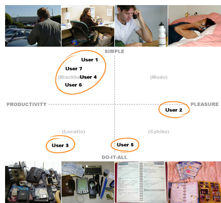
Concept Ideation
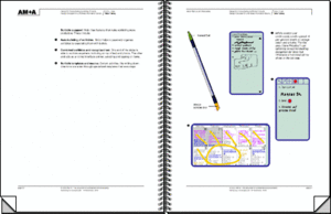
Next, AM+A conducted a series of structured brainstorming sessions. Some core features developed were: driving assistance, smart yellow pages, and e-coupons. Mob-i would take advantage of the always-with-you nature of a mobile phone to form a long term, very personal relationship with the user. Specifications describe a device made easy to use through adaptive menus, responsiveness to natural human behavior and awareness of its location. From the ideation process, AM+A provided Samsung with an illustrated catalog of conceptual product directions.
Prototyping
An interactive prototype was created to demonstrate key scenarios. This prototype allows users to visualize what it is like to receive an e-coupon when entering a store, or screen calls based on their locations. AM+A designed solutions to challenging but important situations, like creating appointments using voice commands and taking notes during a phone call. The final piece provides Samsung executives with a set of ideas for creating a breakthrough product that exploits the unique promise of wireless computing.
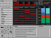
Sendmail: Dashboard Widgets and UI Guidelines

AM+A designed improved widgets for Sendmail’s corporate-email applications dashboards and wrote user-interface guidelines to assist developers.
Project Description
Phase 1: Needs Analysis
AM+A interviewed five stakeholders to develop an understanding of the product and to develop a consensus about needs for improvement. The interviewees were primarily Sendmail managers, many of whom had been users of the product in the corporate world, plus one current high-level user. AM+A’s Needs Analysis Report identified six primary areas in which a re-design would make a significant improvement in usability and proposed strategies for implementing the re-design.
Phase 2: Dashboard Design
Sendmail decided to focus first on developing a “Dashboard” that could be configured by an operations manager or systems administrator, who could see at a glance all of the most important information about the current status of the system.
Challenges
Interviews with Sendmail stakeholders focused on situations in which the application could improve ease-of-use, especially for Sendmail’s new users. In the words of one user, “Mechanically the Sentrion appliance is the best product on the market today…if the UI were just organized into something a little easier and more coherent for the low-cost employee running this stuff, Sendmail would corner the market.”
Improving ease-of-use is especially important at this point in time because Sendmail is targeting a new group of administrators who lack the UNIX and command-line skills of Sendmail’s traditional user-base of IT professionals. It is also a high priority because Sendmail is expanding into new markets in companies focusing on finance and security.
Sendmail’s team selected the dashboard as the highest priority because it would significantly improve functionality for all users and would clearly demonstrate Sendmail’s responsiveness to customer needs.
The greatest challenge was for Sendmail engineers to reach agreement on which information should be displayed in the dashboard. AM+A’s initial proposal assumed that this information would be presented in a wireframe format at the kickoff meeting. However, it soon became clear that deciding on which widgets would be developed and what would be displayed in these widgets needed to be a long, multi-stage process. Only after AM+A’s widget designs were presented could Sendmail reviewers see omissions, imagine the ways that different widgets could be combined more efficiently, and become enthusiastic about possibilities for making additional kinds of information easily accessible.
Successes
Collaboration on an iterative process
AM+A’s most-significant contribution may have been clarifying the dashboard content. By presenting many design options and different models for analyzing the information, AM+A was able to help Sendmail clarify its needs and think about the project in new ways. For example, a control for viewing and managing Clusters and Hosts was not included in the client’s initial widget list, yet it turned out to be key to how all the other widgets functioned. AM+A submitted an initial design and, with each successive iteration of this widget, the model for interacting with the entire dashboard became clearer and more elegant.
Maximizing information available on a single screen
AM+A contributed another significant improvement: showing how information could be presented in a highly compact format. Previous Sendmail Dashboards had used a large amount of screen real estate to present a relatively small amount of information.
AM+A was able to design a compact dashboard that not only made space for more widgets, but made it possible to display more information in each individual widget.
AM+A used several different strategies to accomplish this improvement, including the following:
• A modular grid allows users to swap out and reposition individual widgets to customize the dashboard.
• A system for expanding and contracting widgets enables the user to show/hide charts and additional data.
• A system of status icons quickly cues the user to problems anywhere on the dashboard.
• Re-conceived and re-designed charts and tables provide information more clearly and streamline the design. In the example below, AM+A redesigned a pie chart by converting it to stacked-bar charts, making it possible to show the same data over time and in a more compact space. The design used Tabs to make related data easily accessible.
Previous chart widget design

Re-designed chart widget
AM+A re-designed simple text displays, also, to show additional information in a more compact format, as in the example below.
Previous text widget design

Re-designed text widget

Appearance
AM+A worked to develop a look-and-feel that accommodated differing client demands. Many Sendmail managers felt that the product needed to have a “conservative, no nonsense, get-the-job-done” feel and felt that a previous attempt by outside consultants to dress it up “like a box of crayons” had made the product appear frivolous. However another group felt that many users would welcome a livelier, more contemporary look.
AM+A was able to satisfy these two approaches with a judicious use of color, icons, and graphical elements to improve functionality and to make the communication of essential information more effective, while maintaining existing design guidelines and the look of a serious business tool.
Design guidelines and support for in-house development
AM+A developed an illustrated list of design principles to guide further widget development and to ensure consistency across the application.
AM+A was also able to support Sendmail’s internal User Experience Department by providing source files, color palettes, templates, and technical help as a basis for ongoing in-house development.
Sample design guidelines page

Pitfalls/Lessons Learned
The process might have worked more efficiently if initial interviews had included more users, especially some of the less-technically adept users. Managers typically tend to assume that their interactions with clients have made them familiar with all end-user issues, and Sendmail managers felt that the survey that Sendmail conducted at the beginning of Phase 2 filled in any gaps. However, a chance for AM+A to interact directly with users would have provided a useful outside perspective.
Greater emphasis on conceptual design and developing wireframes before visual design might have streamlined the process. However, AM+A discovered that the Sendmail engineers had difficulty thinking clearly about function until after seeing the visual design, probably because the compact and attractive design of dashboard was a significant departure from all previous Sendmail screens.
Current Status
Sendmail has shown the dashboard design to Sendmail project managers, technical sales engineers, and to some high-level users. The response to the overall design has been good, and Sendmail’s user-experience team has been focusing on refining the details. The final designs recently were shown to a new round of users, who have requested new features. This review and revision process will probably continue internally for several more rounds with Ms. Truong and Giron implementing the changes in mockups. Sendmail will probably only have a limited set of widgets ready for the next release. A fully user-configurable dashboard may not be implemented until the following release cycle.
Servador
Servador used the Web to become the world’s largest provider of printing services in the $150 billion commercial printing market, a market that is fragmented and in which individual print jobs move across multiple organizations as they evolve from concept to production. Servador asked AM+A to design the Web application that will help them to realize their goal.
Servador needed a way for print buyers to specify, bid out, and manage their projects by maintaining a digital relationship with their communities of print vendors. It became clear that if given the right tool, print buyers would rely heavily on this tool to accomplish most of their daily work. The tool also had to appeal to vendors by simplifying lead tracking and scheduling. However, Servador’s main goal was to become the print buyer’s “killer app.”
A major challenge in this effort was to provide practical means for buyers to communicate with, and track the progress of, the multiple vendors that are often involved in individual print projects. Another challenge was to produce the means to specify in detail any conceivable type of print job. Working with Servador staff with extensive print industry experience, AM+A designed a user interface organized according to the work sequence of the print procurement and production process itself. Print projects proceed through a set of steps that have distinct tasks and reporting requirements. Servador treats each print project as an “object” that is modified and refined as it passes through these steps, while having all its relevant information displayed, saved, and compiled for later retrieval and analysis.
The Ford Foundation: Information Services Site
AM+A developed an information and help-center intranet site for a major non-profit organization.
The SABRE Group: Travelocity™
AM+A consulted on a consumer travel reservation Website.
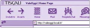
Tiscali: International Web Portal

AM+A supported one of Europe’s largest internet service providers, Tiscali, as a partner on user-experience strategy and user-interface design.
Services
User Experience Strategy, Brand Analysis, User Interface Design
Project Duration
2001 – 2002
Media
Web
Project Description
AM+A supported one of Europe’s largest internet service providers, Tiscali, as a partner on user-experience strategy and user-interface design.
With Web portals in Italy, Germany, England, France, and Netherlands, among other countries, Tiscali competed with AOL and MSN as one of Europe’s largest and fastest growing Internet service providers. When Tiscali contacted AM+A, they faced the challenge of creating a consistent user experience for audiences across Europe while maintaining local appeal.
Through a series of projects related to Tiscali’s proprietary browser, portals, service channels, and other applications, AM+A helped Tiscali create a uniformly attractive and easy-to-use Internet presence throughout Europe:
User Experience and Branding: AM+A analyzed the strength of the Tiscali brand and user experience across various Tiscali products, including the Tiscali browser, chat, and instant messaging service.
Content Development: AM+A designed and developed universal portal content to compliment localized information presented on Tiscali portals throughout Europe.
Expert Evaluations: AM+A conducted systematic reviews of the browser, portals, and channels to identify usability issues related to navigation, product integration, and design integrity.
Visual Design: AM+A developed icons and visual elements to create a consistent, elegant, and friendly suite of internet services. AM+A designed additional “skins” for new services as they were added to the Tiscali product line.
UI Design Guidelines and Training: AM+A led the first-ever company-wide UI design standards efforts and prepared documents helpful for Tiscali to develop improved UI standards.
Unigraphics Solutions: CAST v.15

AM+A puts Unigraphics ahead of its competitors with a new user interface that made CAST 15.0 easier for new users to learn.
Services
User Interface Design, HTML Prototyping
Project Duration
July 98 – Sept 98
Media
HTML on CD-ROM
Project Description
Unigraphics Solutions, Inc. markets a leading high-end CAD/CAM application that is used to design complex manufactured products, such as the new International Space Station. CAST, USI’s own comprehensive html tutorial (Computer-Assisted Self-Teach), was losing market share to a competing third-party product that offered a more sophisticated design, yet had inferior content. USI asked AM+A to improve both the perceived quality of CAST and its usability. AM+A designed a new brand identity, The Rubber Browser, and a new navigation structure that built customer appeal and respect for CAST, and allowed users to focus on reaching their training goals.
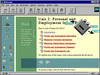
University of California: Employee Services Intranet
AM+A planned the development of The University of California’s employee services intranet.
Vantive Corporation: Vantive Sales™
AM+A designed UI metaphors and guidelines for a Customer Asset management application.
Vitalcom: Networked Monitoring™
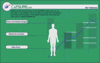
AM+A designed the main display screens of a networked hospital patient vital-sign monitoring system.
Wells Fargo: Nikko Investment Advisors
AM+A designed a prototype Investment advising application.
Xerox Corporation: Intran™

AM+A designed and produced a disk-based interactive product marketing presentation for a forms design product.
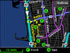
Zip2: Zip2.com
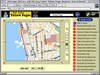
AM+A designed color standards for a geographical mapping and routing Website.