Aaron Marcus has proposed a “modest plan to save the US economy.” His redesign of US currency involves the US Treasury Department allowing anyone’s face to appear on the front of US currency and any corporate logo on the back, provided each sponsor pays $100 million to the US Treasury. If 7,000 wealthy people and corporations sign up worldwide, that would raise $700 billion for the US Government, about half the 2010 fiscal deficit or about the amount that the government paid for the recent economic bailout. This design project provides an incentive to wealthy individuals and companies to give part of their wealth to the US Government. Grandparents might want to see their grandchildren featured. Entertainment stars and political leaders could see their faces everywhere. This idea recognizes that one of the US’ greatest exports is its US currency. Read more
Finding a sustainable way of life is a 21st-century global challenge. The “green” movement helped to increase people’s awareness of sustainability issues and propelled development of products to help decrease our ecological footprint. Smart grid applications enabling users to monitor their energy consumption are some of these innovative products. However, most are targeted to the PC and don’t focus on innovative data visualization. Communicating critical data helps build awareness, but does not result automatically in effecting behavioral changes. The question then shifts to how exactly to motivate, persuade, educate, and lead people to reduce their energy consumption.
For the Green Machine project, 2009-10, AM+A researched, analyzed, designed, and evaluated powerful ways to improve sustainability-oriented behavior by persuading and motivating people, especially home consumers to reduce energy consumption and increase increase efficiency and recycling by means of a well-designed mobile phone application concept prototype: the “Green Machine.” AM+A designed and tested a prototype Green Machine application oriented to making energy conservation behavior changes and redesigned and improved the user interface based on interview-participant feedback. The Green Machine uses principles of combining information design/visualization and persuasion design.
AM+A’s presentation and white paper explain the development of the Green Machine’s user interface, information design, information visualization, and persuasion design. The project has been published in case studies and articles in the USA, Europe, South Africa, and South Korea. Aaron Marcus has lectured about the project in Canada, France, Germany, Switzerland, and the USA, among other countries. Aaron Marcus’ Green Machine lecture is on YouTube:
Finding a life-enhancing and life-preserving way of life is a 21st-century global challenge. Obesity and type 2 diabetes are increasing in many countries. Health/nutrition information, products, and services available to increase people’s awareness of health issues and propel changes by monitoring food are targeted to the PC/Web, do not focus on innovative data visualization, and lack persuasive effectiveness. Communicating critical data helps build awareness, but does not result automatically in effecting behavioral changes. The question then becomes: How can we motivate, persuade, educate, and lead people to reduce their food consumption and exercise more?
For its Health Machine concept design of 2010, AM+A researched, analyzed, designed, and evaluated powerful ways to improve healthful behavior by persuading and motivating people, especially those 50+ from lower economic and educational levels, to reduce food consumption and increase exercise by means of a well-designed mobile-phone application concept-prototype: the “Health Machine.” The author’s firm designed and tested a prototype Green Machine application oriented to making energy conservation behavior changes in 2009. The Health Machine uses similar principles of combining information design/visualization and persuasion design. AM+A reviewed the presentation with a certified dietician and redesigned screens based on her recommendations. AM+A’s presentation and white paper explain the development of the Health Machine’s user interface, information design, information visualization, and persuasion design. AM+A is publishing a case study about the project and lectures about the project worldwide.
For two different clients, as yet not disclosable, AM+A provided cross-cultural analysis services.
In one project, AM+A conducted a culture audit of a software product that the client was localizing for a very different language, writing system, and culture. AM+A analyzed the graphics, icons, terminology, and concepts of the original product, using the assistance of third-party language-subject-matter experts. AM+A idenetified problemmatic issues and provided specific recommendations for improvements. The client considered AM+A’s report very valuable for the localization process. Without this kind of analysis, one might make excellent translations of content that should never have been included in the first place.
In a second project, AM+A conducted an analysis of the country and corporate cultures of a major corporation with offices in many countries. AM+A identified potential issues that might affect the ability of multi-disciplinary, multi-cultural, multi-country teams to cooperate, collaborate, and communicate. Examples of differences included culture-influenced teams in which This information enabled the client to develop better solutions for its development teams.
AM+A Designed and produced a series of CD-ROMs containing educational multimedia science content.
Services
User Interface Design, Project Management, Programming, CD-ROM Mastering
Project Duration
June 98-Oct 98
Media
Macromedia Director on CD-ROM
Project description
Cogito Learning Media, Inc., a publisher of educational multimedia products, asked AM+A to design the user-interface for its Eye-to-Mind series of CD-ROMs for high school and undergraduate science students. Eye-to-Mind is an audio/visual aid to be referenced by professors during lectures, and to be used as a study aid. Cogito’s challenge was to create a high-quality product with a narrow focus that could sell at a very low price point.
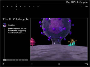
AM+A de-emphasized navigational controls in order to focus attention on the content. This simple, neutral, quiet interface encourages exploration, and allows for easy re-use of the shell for other titles. Animations such as the Aids virus invading a cell, voice-overs, diagrams, and images convey high-level, difficult-to-understand concepts in an engaging narrative format. Audio voice-over helps retention by allowing students to hear as they see, as well as to help them learn correct pronunciation of scientific terms.
Quiet Interface
Cogito wanted a “neutral stage” to present a variety of modular content consistently. The content is simply organized and is not extensive in scope, allowing minimal titling. Eye-to-Mind is meant to be browsed and experienced over and over by students to solidify their understanding of the content.
Subtle Lighting Effects
Live items on the screen “backlight” on rollover to signal their status.
Favoring quality versus quantity, Eye-to-Mind fully leverages the combination of motion, sound, color, layout, and narrative to efficiently convey information in a form that is clear and memorable.
Harpooning a Cell
AM+A worked with top scientific illustrator/animators to convey content authored by the leading authors in the field. We were a key link in the team’s effort to convert “book information” into interactive content.
Careful storyboarding and an iterative review process with the authors ensured accuracy and quality control.
In this view, the illustrator visualizes the Aids virus “harpooning” and penetrating a living cell membrane. Assigning shapes, colors, positions, and movements to such abstract concepts as cells, viruses, and proteins drastically improves students’ memory retention.
Audio voice-over
Eye-to-Mind delivers narrative content to students via voice-overs instead of using long, scrolling text passages. Transcripts, however, are easily accessible via pop-up windows.
The voice-overs allow students to focus on the animations and thus benefit from the increased retention resulting from seeing and hearing coordinated content. Voice-overs also help students to correctly pronounce complex scientific words, which is an important part of impressing any science professor!
Beginning in 1984 and continuing across three decades, AM+A worked with several R+D, human factors, marketing, and product development teams.
AM+A digitized the HP logo for the first time in HP’s history for HP’s desktop publishing corporate clients in 1984 and developed a clip-art library as an HP Vectra product.
In 1992, AM+A designed HP’s corporate standards and templates for slides created in three desktop slide-making applications.
During 2003-2005, AM+A worked closely with the Director of HP’s Mobile Media and Systems Lab to write and design executive marketing presentations of next-generation products. HP’s CEO complimented AM+A’s presentation, and the presentation helped land a partnership with Starbucks.
In 2005, after helping to design the key control screens for HP’s first commercial version of its Halo telepresence system, AM+A worked with HPs product development group to conduct usabiity tests for its second-generation Halo system.
Founded in 1968 and headquartered in Santa Clara, California, Intel is the world’s largest semiconductor chip maker, developing integrated circuits and other advanced integrated digital technology products to computing, communications, and other industries. Intel’s products line include chips, boards and other semiconductor products that serve as the building blocks integral to computers, servers, consumer electronics, handheld devices, and other networking and communications products. Component-level products include microprocessors, chipsets and flash memory.
In 2008, Intel engaged AM+A to facilitate the development and testing of the user interface for its product designed to assist C++ developers in improving program performance by providing targeted code analysis, advice and instruction for implementing parallelism within a serialized program. Target users of Threading Advisor are developers and architects experienced in writing serialized code, yet unaccustomed to coding to support parallelism, and possibly even unfamiliar with core threading concepts. AM+A conducted these tasks.
Needs Analysis: Provided thorough examination of the existing prototype and supporting documentation, in addition to critical insights into the reasons for existing usability issues and an array of possible solutions and improvements.
Conceptual Design: In Round 1, provided new conceptual models incorporating an improved user interface and new features, such as streamlined navigation, task list integration and management, expandable and collapsible instructions, and other modular elements.
Usability Testing: Conducted two-day testing session and wrote detailed report of test findings and recommendations.
Conceptual Design: In Round 2, added updates to the first conceptual design document, included minor revisions and changes identified in AM+A’s usability testing report.
Visual Design: Included full-color screens and a full product icon set.
Intel’s project manager was very satisfied with AM+A’s work and provided a letter of recommendation.
Kaiser Permanente (KP) is an integrated managed care organization, based in Oakland, California. Operating in nine states and Washington, D.C., Kaiser Permanente is the largest managed care organization in the United States. Kaiser Permanente has 8.7 million health plan members, 156,000 employees, 13,729 physicians, 37 medical centers, 400 medical offices, and $34.4 billion in annual (2008) operating revenues and $1.3 billion in net income.
In June of 2006, Kaiser engaged AM+A to analyze and test the usability of the Clinical Library (CL), a Web-based internal information resource. The Clinical Library makes a wide variety of clinical information available to physicians, clinicians, and nurses, both during actual patient care and at times when they are engaged in research or study. Through the Clinical Library, KP clinicians and nurses can find internally produced guidelines for medical conditions and procedures, find and print out patient handouts, reach other Kaiser Websites, access external resources such as journals and medical texts, and reach a wide variety of other resources of a operational or managerial nature.
Working with a team from CMI, AM+A drew up an interview script and interviewed sixteen clinicians and nurses in their offices in four KP regions: Colorado, Northern California, Northwest, and Southern California. Subjects were given a series of mostly medical questions, and asked to find answers using Clinical Library.
The Usability Analysis report resulting from this study detailed both the powerful potential of the CL to serve its target audiences and numerous severe usability issues currently limiting its effectiveness, particularly during time-critical periods of actual patient care. The report detailed 31 major “observations” concerning usability issues, grouped in four general categories such as “Search Issues” and “Navigation Issues.” A fifth category detailed observations of the effectiveness of “Clinical Tools,” a partial restructuring of the CL UI that had been implemented in the Colorado region. A table of priorities was prepared based on comments by the interview subjects. AM+A made preliminary recommendations for how each issue could best be resolved.
In the fall of 2007, Kaiser asked AM+A to propose a usability analysis and design project to address some of the issues discovered in the 2006 report. The proposal divided work into two Phases: Phase 1 was a rapid, two-month project focused on a “proof of concept” redesign of the most time-critical parts of Clinical Library, with four rapid tasks including a paper user test conducted by phone. Phase 2 was a six-month complete redesign, including the development of an interactive prototype and three user tests in the field.
AM+A completed its final work on the project at the close of 2008. Final user tests showed significant improvements in speed of navigation and user satisfaction. Based on the success of the project, Kaiser provided a letter of recommendation.
Since 1989 for Motorola, 1996 for Nokia, and 1997 for Samsung, AM+A has worked with advanced R+D groups in research, design, and evaluation of next-generation mobile products.
In 2006, AM+A developed use scenarios and designs for video-related applications involving social networking, then carried out user evaluations to obtain user-feedback about the designs.
In 2005, AM+A developed personas and use scenarios to help Nokia envisage next generation smart phones. This work was carried out for Nokia’s UK-based design center.
In 2000, AM+A researched, then designed more than 100 smart phone concepts for Samsung mobile devices targeted for North America. AM+A published a case study about its work in Interactions Magazine.
AM+A designed improved widgets for Sendmail’s corporate-email applications dashboards and wrote user-interface guidelines to assist developers.
Project Description
Phase 1: Needs Analysis
AM+A interviewed five stakeholders to develop an understanding of the product and to develop a consensus about needs for improvement. The interviewees were primarily Sendmail managers, many of whom had been users of the product in the corporate world, plus one current high-level user. AM+A’s Needs Analysis Report identified six primary areas in which a re-design would make a significant improvement in usability and proposed strategies for implementing the re-design.
Phase 2: Dashboard Design
Sendmail decided to focus first on developing a “Dashboard” that could be configured by an operations manager or systems administrator, who could see at a glance all of the most important information about the current status of the system.
Challenges
Interviews with Sendmail stakeholders focused on situations in which the application could improve ease-of-use, especially for Sendmail’s new users. In the words of one user, “Mechanically the Sentrion appliance is the best product on the market today…if the UI were just organized into something a little easier and more coherent for the low-cost employee running this stuff, Sendmail would corner the market.”
Improving ease-of-use is especially important at this point in time because Sendmail is targeting a new group of administrators who lack the UNIX and command-line skills of Sendmail’s traditional user-base of IT professionals. It is also a high priority because Sendmail is expanding into new markets in companies focusing on finance and security.
Sendmail’s team selected the dashboard as the highest priority because it would significantly improve functionality for all users and would clearly demonstrate Sendmail’s responsiveness to customer needs.
The greatest challenge was for Sendmail engineers to reach agreement on which information should be displayed in the dashboard. AM+A’s initial proposal assumed that this information would be presented in a wireframe format at the kickoff meeting. However, it soon became clear that deciding on which widgets would be developed and what would be displayed in these widgets needed to be a long, multi-stage process. Only after AM+A’s widget designs were presented could Sendmail reviewers see omissions, imagine the ways that different widgets could be combined more efficiently, and become enthusiastic about possibilities for making additional kinds of information easily accessible.
Successes
Collaboration on an iterative process
AM+A’s most-significant contribution may have been clarifying the dashboard content. By presenting many design options and different models for analyzing the information, AM+A was able to help Sendmail clarify its needs and think about the project in new ways. For example, a control for viewing and managing Clusters and Hosts was not included in the client’s initial widget list, yet it turned out to be key to how all the other widgets functioned. AM+A submitted an initial design and, with each successive iteration of this widget, the model for interacting with the entire dashboard became clearer and more elegant.
Maximizing information available on a single screen
AM+A contributed another significant improvement: showing how information could be presented in a highly compact format. Previous Sendmail Dashboards had used a large amount of screen real estate to present a relatively small amount of information.
AM+A was able to design a compact dashboard that not only made space for more widgets, but made it possible to display more information in each individual widget.
AM+A used several different strategies to accomplish this improvement, including the following:
• A modular grid allows users to swap out and reposition individual widgets to customize the dashboard.
• A system for expanding and contracting widgets enables the user to show/hide charts and additional data.
• A system of status icons quickly cues the user to problems anywhere on the dashboard.
• Re-conceived and re-designed charts and tables provide information more clearly and streamline the design. In the example below, AM+A redesigned a pie chart by converting it to stacked-bar charts, making it possible to show the same data over time and in a more compact space. The design used Tabs to make related data easily accessible.
Previous chart widget design
Re-designed chart widget
AM+A re-designed simple text displays, also, to show additional information in a more compact format, as in the example below.
Previous text widget design
Re-designed text widget
Appearance
AM+A worked to develop a look-and-feel that accommodated differing client demands. Many Sendmail managers felt that the product needed to have a “conservative, no nonsense, get-the-job-done” feel and felt that a previous attempt by outside consultants to dress it up “like a box of crayons” had made the product appear frivolous. However another group felt that many users would welcome a livelier, more contemporary look.
AM+A was able to satisfy these two approaches with a judicious use of color, icons, and graphical elements to improve functionality and to make the communication of essential information more effective, while maintaining existing design guidelines and the look of a serious business tool.
Design guidelines and support for in-house development
AM+A developed an illustrated list of design principles to guide further widget development and to ensure consistency across the application.
AM+A was also able to support Sendmail’s internal User Experience Department by providing source files, color palettes, templates, and technical help as a basis for ongoing in-house development.
Sample design guidelines page
Pitfalls/Lessons Learned
The process might have worked more efficiently if initial interviews had included more users, especially some of the less-technically adept users. Managers typically tend to assume that their interactions with clients have made them familiar with all end-user issues, and Sendmail managers felt that the survey that Sendmail conducted at the beginning of Phase 2 filled in any gaps. However, a chance for AM+A to interact directly with users would have provided a useful outside perspective.
Greater emphasis on conceptual design and developing wireframes before visual design might have streamlined the process. However, AM+A discovered that the Sendmail engineers had difficulty thinking clearly about function until after seeing the visual design, probably because the compact and attractive design of dashboard was a significant departure from all previous Sendmail screens.
Current Status
Sendmail has shown the dashboard design to Sendmail project managers, technical sales engineers, and to some high-level users. The response to the overall design has been good, and Sendmail’s user-experience team has been focusing on refining the details. The final designs recently were shown to a new round of users, who have requested new features. This review and revision process will probably continue internally for several more rounds with Ms. Truong and Giron implementing the changes in mockups. Sendmail will probably only have a limited set of widgets ready for the next release. A fully user-configurable dashboard may not be implemented until the following release cycle.